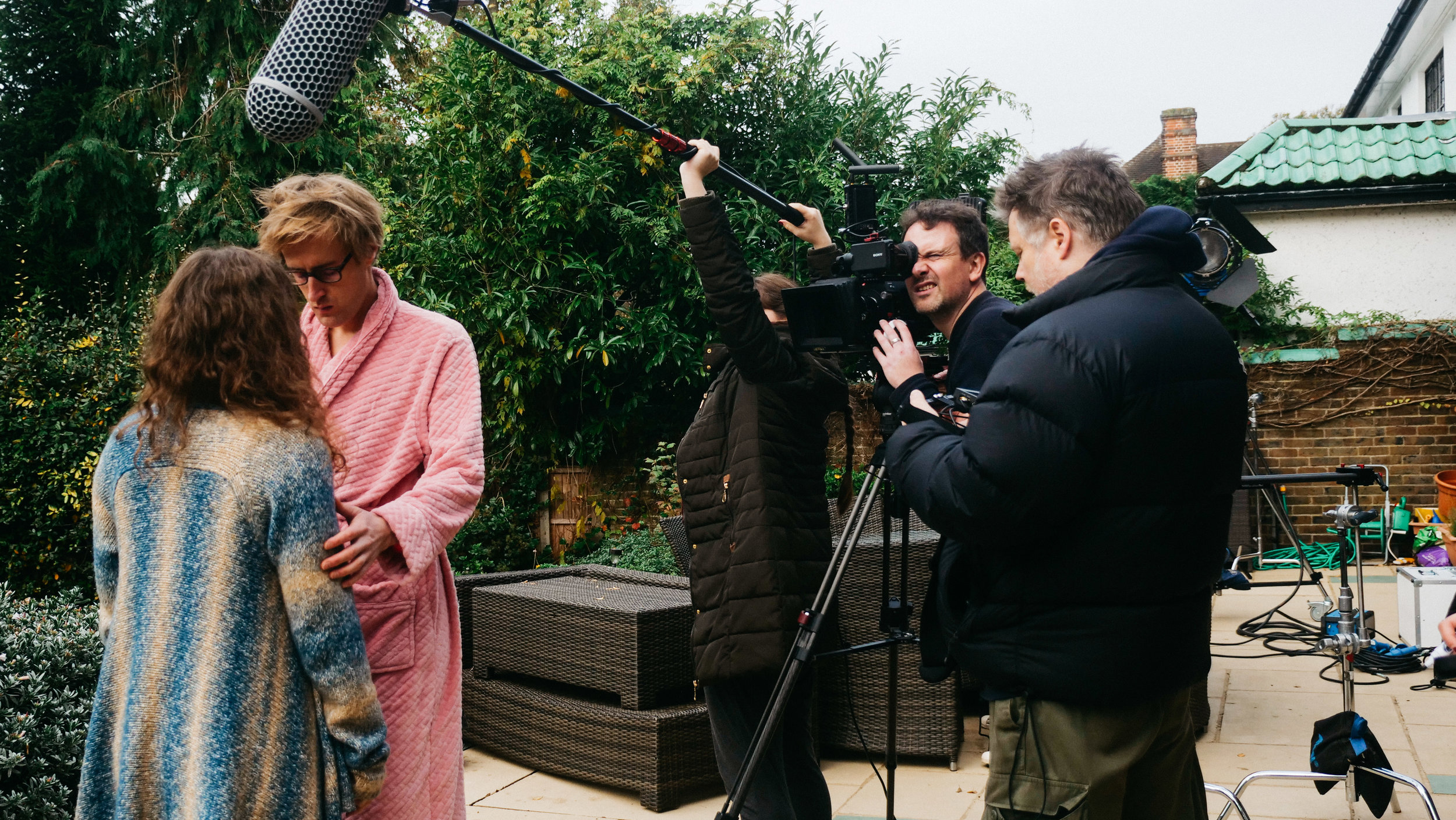
I was recently DP on a series of short Christmas films for director Chris Jones and the London Screenwriters Festival team. I planned on doing a detailed lighting breakdown of all the scenes, but we moved SO fast during the shooting that I never had time to take detailed notes or even photos of most of the setups.
Instead, I'm going to write about how I approach lighting a shoot like this. Specifically one that is very limited by both time and budget. I wouldn't exactly say we had a 'shoestring' budget. I had a gaffer with a small van of lights and an AC to help me out. But for the quality we wanted in the end result, it was a tough shoot!
*Notes from the grader at the end of the blog.
Here's PART 1:
I didn't do any pre lighting plans on paper as I've worked with Chris before and I know he likes to move fast and keep options open. Block. Light. Shoot.
So I'm going to go through some scenes and try to give examples of how we squeezed everything we could into the tight timeframes. My gaffer Jazz Bahalla had brought the following kit:
1x 2.5HMI, 1x joker bug 800, 2x 2k blonde, 2x 1k, 2x 650, 2x 300, 1x dedo kit (3 head), 1x 4’4 kino, 1x 2’4 kino. - And I'd brought my Skypanel RP60 and Cineflex light.
I knew that Jazz would be doing pretty much all the heavy lifting, so I wasn't looking at these lights thinking 'lot to choose from', I'm thinking, 'what's the least amount of stuff we can get off the van? How can we have a small footprint on the sets? How quickly can we move lights? Can we re-use lights already setup from one scene to the next? Something important I've learned is to understand where to compromise depending on the needs of the shoot. It's not about ever being sloppy. It's about balance.
(All shot on Fs7, Slog3, Cine EI with Veydra Primes)
CAR
Many ways to light a car, but the absolute simplest way to do this was to sandwich them with light. My thinking was there was some kind of cooler light on the street and a warmer glow coming from the house. In this scenario does it matter what the street source is supposed to be? I wanted them downside keyed, while still keeping it cosy and intimate. This was the last scene of day 1. It was late. We had an early start the next day and long drives home. It was freezing. The scene is short. So I'm lighting with all that in mind to just get what we need from the scene.
HALLWAY
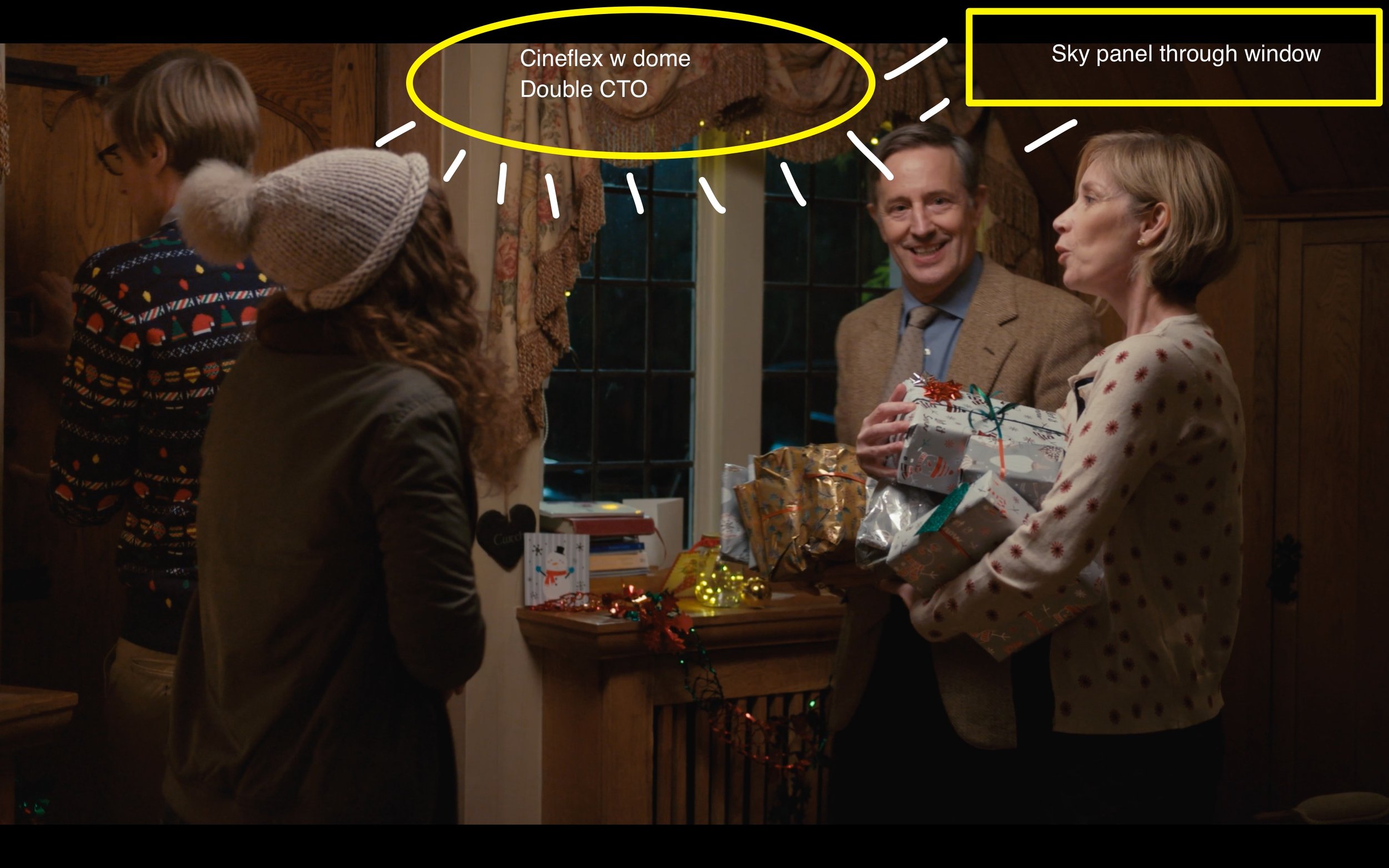
This is an example of a scene that could become very tricky 'if' you over think it. It's exterior to interior and a group of people, all facing in different directions. On another production, we might relight every angle, but what we wanted to do here was ONE lighting setup to rule them all.
*correction. Single CTO above. Don't want to redo the drawings!
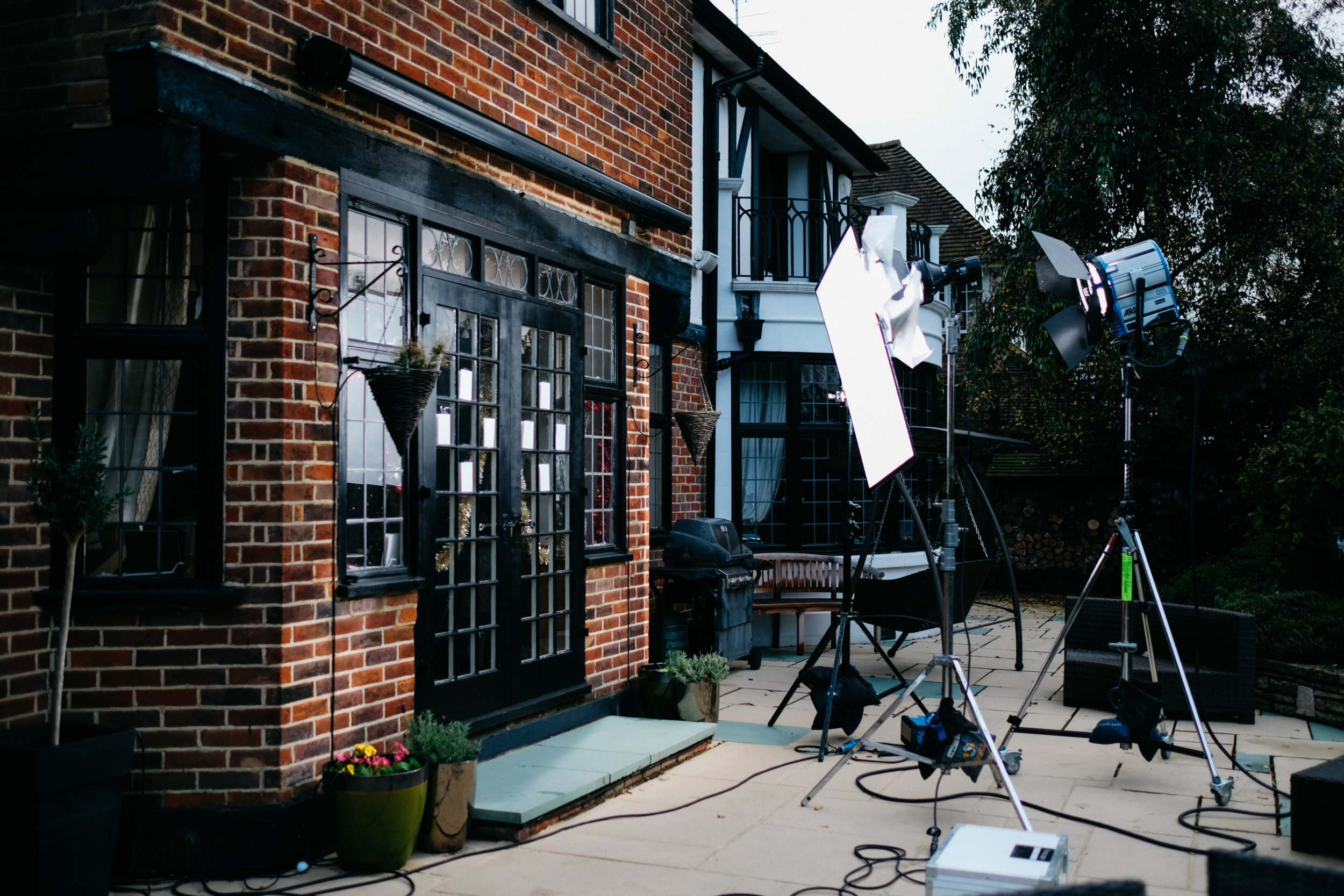
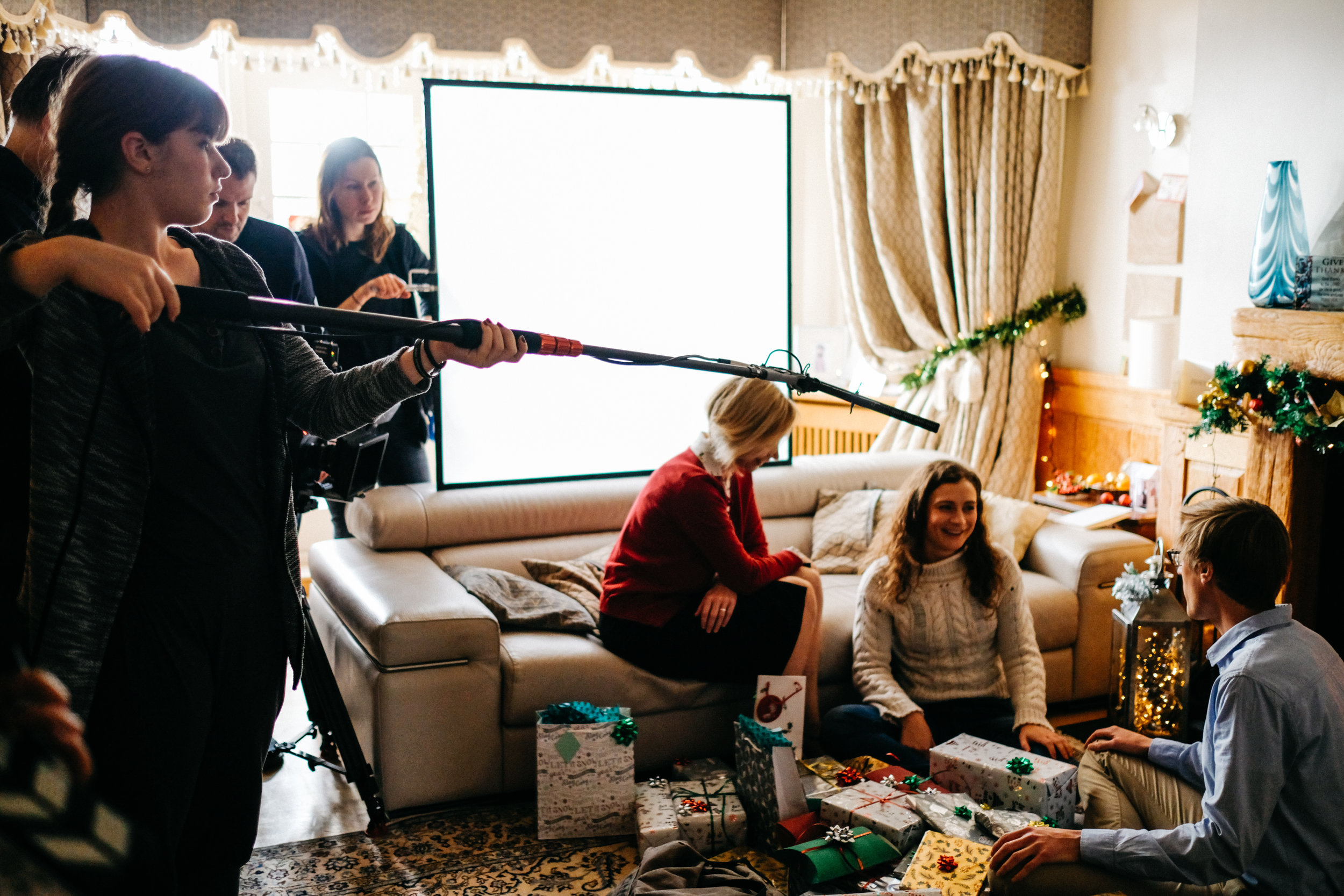
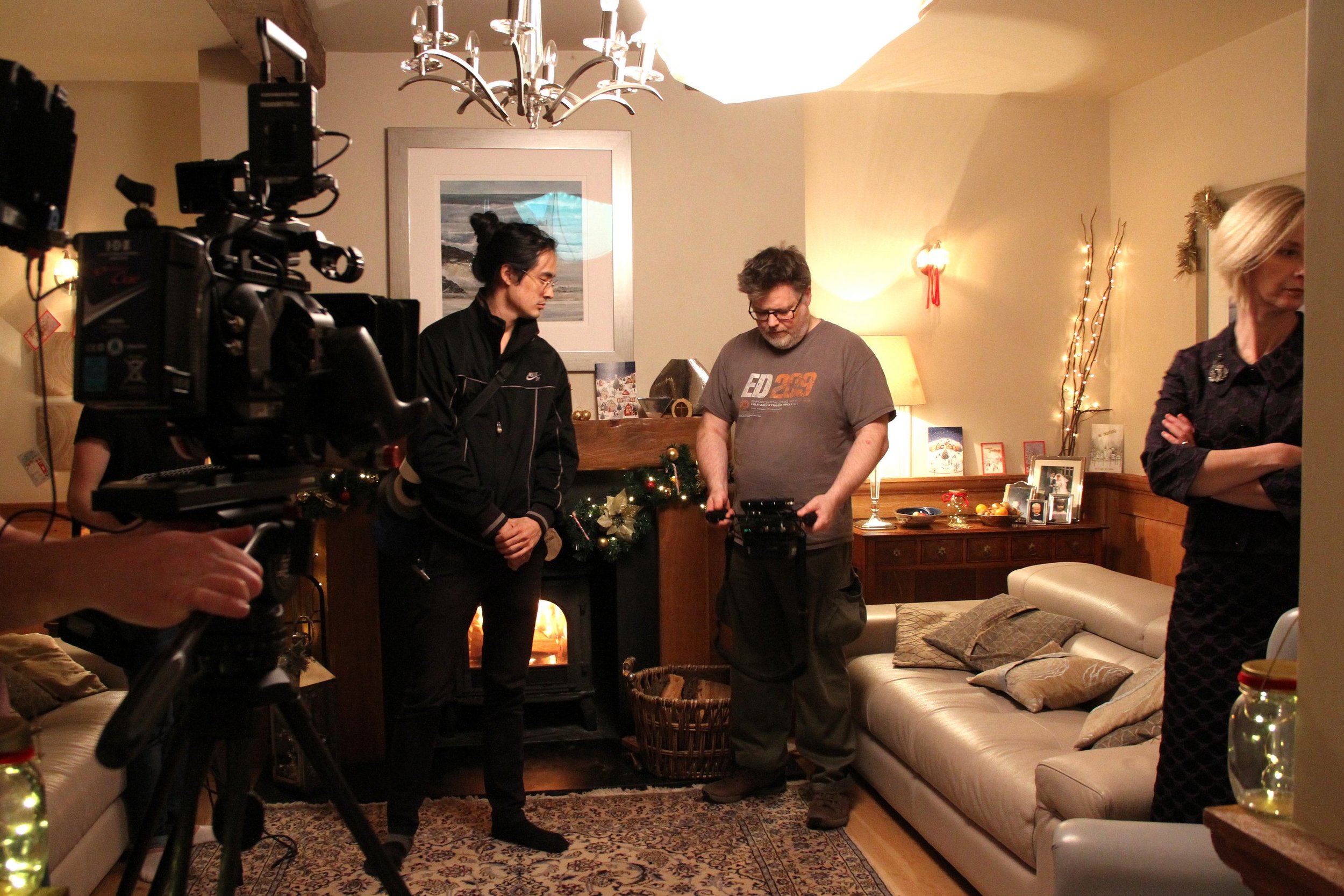
I've got a Skypanel outside, high up and right against the wall pointing down. This is purely to give them a little edge light at the door. An HMI is hitting through the trees at the back to show up the car from previous scene and also give some background separation. But the star of the show is my humble Cineflex panel (review here). We boomed that out on a double C-Stand arm, with the dome diffuser. This keyed all the actors with even soft light. We moved it around a little for the different angles, and had to use some bolton to flag it off the walls a bit, but this was a case of simple tweaks. So once we had this scene lit, we blasted through it!
DINING ROOM
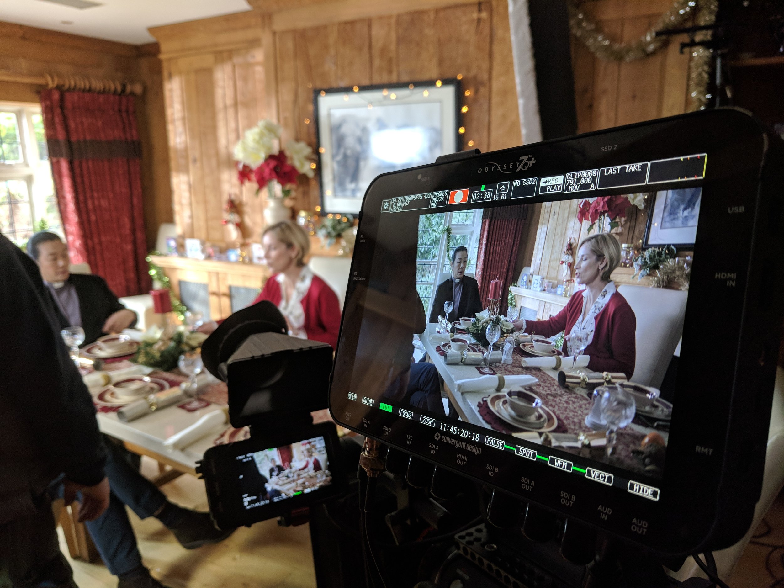
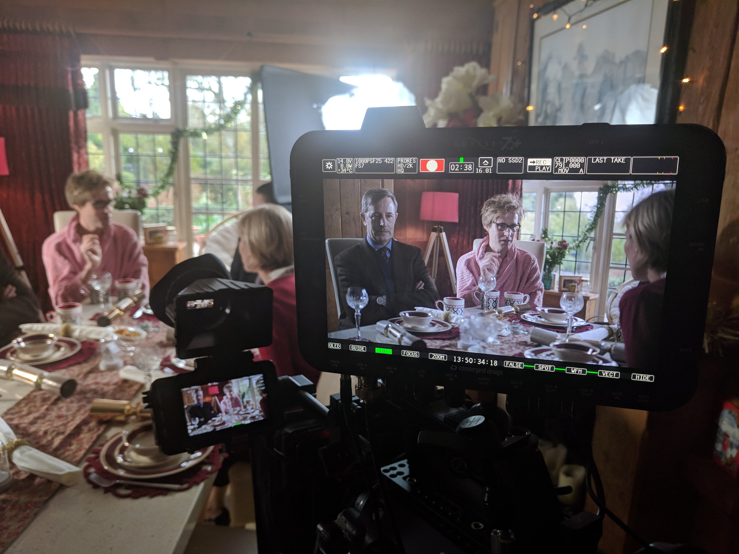
The dining room is another scene that could have been tricky. Because of the layout, we were pretty much forced to be pointing out windows. This meant I needed some lights with a bit of punch to balance it all out. I have a fairly simple 'formula' for lighting day interiors. Big soft key, hard accents. Off course this is about style and tone, but for something like this, a Christmas comedy, I can go for nice natural lighting. For all the dining room setups, I was using the 2.5k HMI (usually through 4x4 diff), a Joker 800, and the ubiquitous Skypanel.
This was another case of lighting to cover all the shots, without having to move them once set. So what's working on the wide is also keying our mum and dad characters. The 2.5k keying mum, while the Skypanel is keying the Vicar and then the dad when he turns. I try to keep everything coming from the same direction, and downside to camera to sell that illusion of window light.
It's also worth mentioning that we shot a few other scenes in this setup, but because of blocking, lights had to be repositioned slightly. You can see that I'm trying to keep lighting downside. To do this, we're just moving the lights, or swivelling a head, e.g. The Joker is lighting the fireplace and then swivelled to light up the kitchen.
GRABBING WHAT YOU CAN
These are a couple of quick examples of just getting what you can with what you have to work with. The below shot is entirely natural light. This was a case of noticing that the sun just happened to be doing my job for me - and we grabbed it!
And this was a scene shot at night (November has very little daylight in the UK, and was another reason we were so pushed all the time). Chris needed to get this scene and I knew I couldn't light the entire kitchen in time. It would have been very hard to keep it all looking natural. So we used the door as a frame to hide the fact it was night. Now we are lighting a tiny area. Skypanel key and a Joker 800 down the wall. Job done!
THE NATIVITY
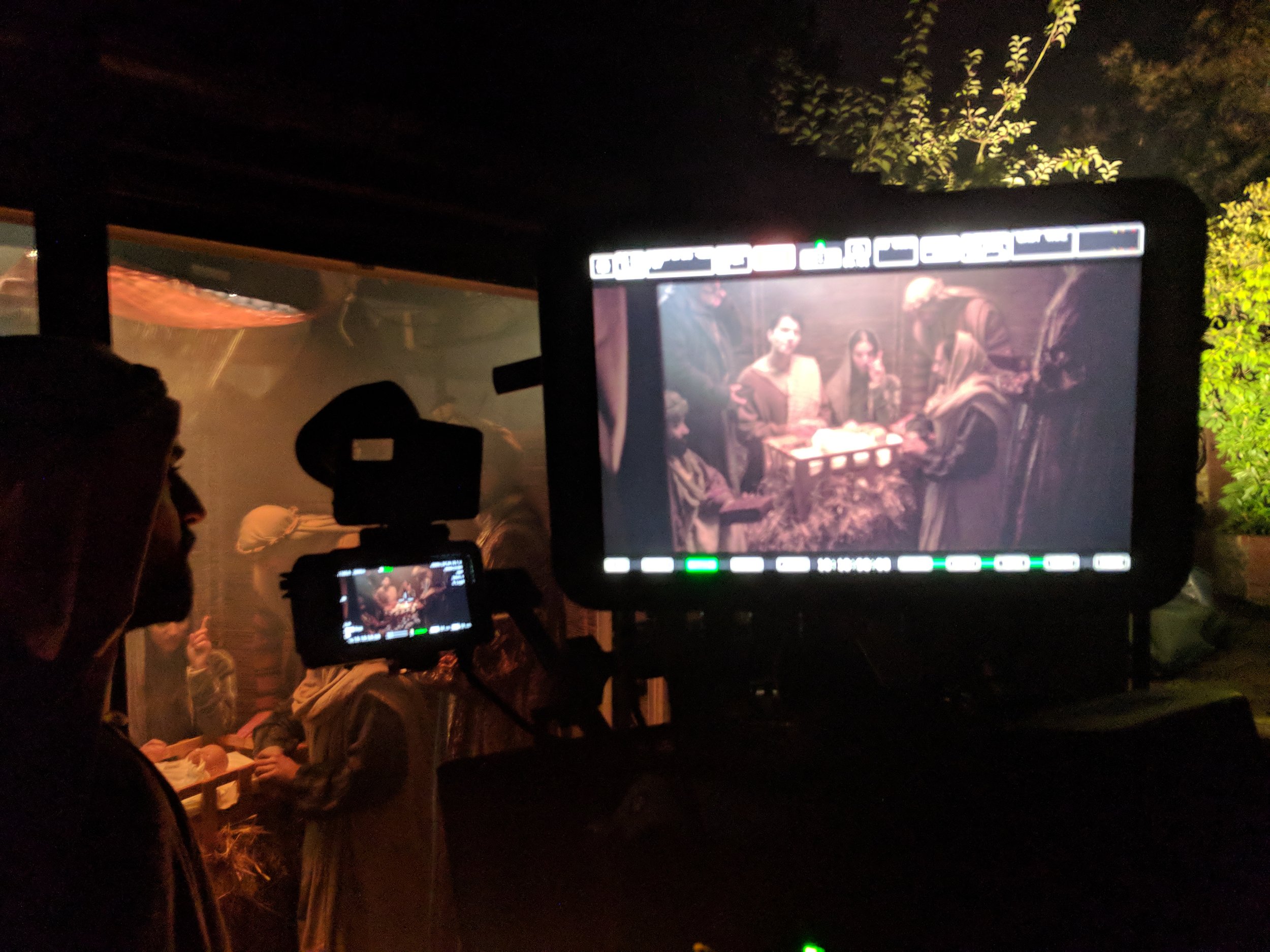
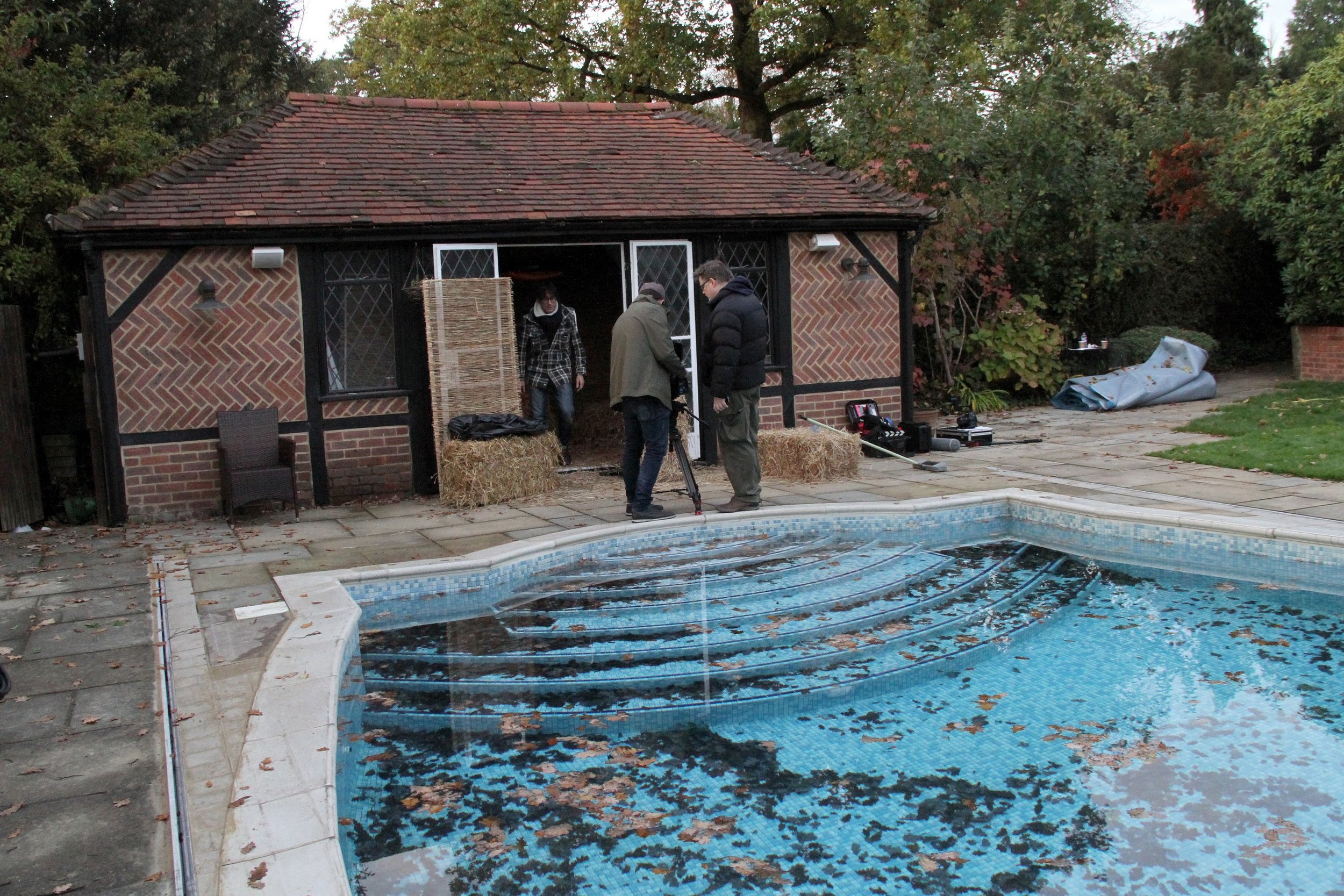
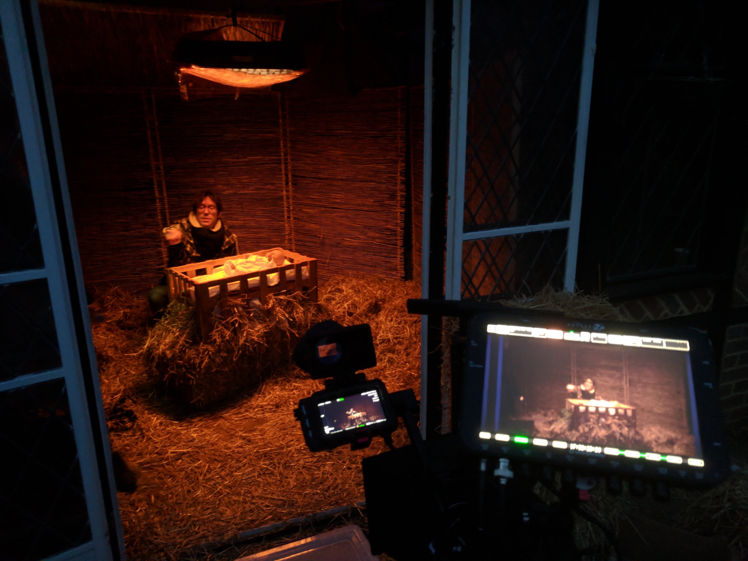
One of the last things we shot was the Nativity itself. We knew it was coming, and knew we had to turn a little pool house into a 1st century barn - full of actors! It was something we kept laughing about throughout, but inside I was crying a bit :)
This is the inside of the pool house:
Chris Jones looking extremely optimistic! We are all saying "Hmmmmmm"
Luckily I had more time to light this than any other scene. Turns out I needed the time, as it was very much trial and error. I quickly realised that I needed to put in as LITTLE light as humanly possible. The more light I put in, the more we were going to give the game away. Shadows were our friend. So in the end we went super simple again.
We had the Cineflex at 2% here! There's an argument that I should be bringing up the light and over exposing to bring it all down in post. But then light is going to spill, and the blacks were going to be so crushed anyway. So this is pretty much in camera exposure. To say I was happy with the result on this is an understatement. I still can't quite believe we pulled it off. This was very much everyone pulling together. Set design, costume, Chris blocking the scene. Everything coming together to make that tiny space work!
When it came to doing the closer shots, we simply moved the Cineflex to the side for a more dramatic light.
GRADE
The Sony Fs7 often gets bashed. I have said many times that the Fs7 can look great if GRADED properly. I really like how Francois Kamffer treated the footage here, so I asked him to say a bit about his grade:
The way I have set up my scene in Davinci Resolve 12 was pretty straight forward for Meet The Nativity. Apart from the usual resolution settings I worked straight from the 4K MXF files to avoid any further compression on down scaling and any concatenation. I do like that there are some noise in the low lights with the Fs7.
I had a look at the Sony Slog to Rec709 LUTs which is available through Davinci Resolve but Chris Jones wanted to have a film look associated with the film and in my opinion the Sony to Rec709 LUTs dont quite give me that edge.
What I have used instead was the Rec709 to D65 Filmlook LUT which is available through Davinci. That gave me the edge that I wanted. I then increased the saturation quite a lot to get the indoor festive look that Jones wanted and balanced it from there on. I used a basic node setup of Saturation a Balance node and a Key node to warm up the shadows slightly.
